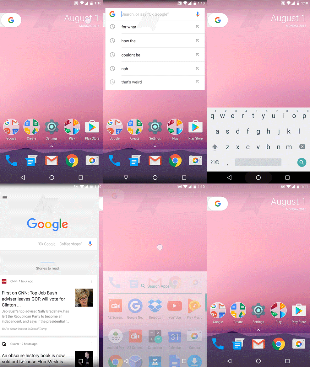
Android Police got their hands on some really convincing GIFs that show an allegedly redesigned launcher to debut on this year’s new Nexus Marlin and Sailfish handsets. We still don’t know much about the handsets themselves except for a couple of mock-ups here and there.
The launcher in question could be reflective of the final release, but is subject to change as we near the Nexus device refresh and impending release of Android Nougat 7.0.
As soon as you see the screenshots, you’ll notice there is no longer a Google Search bar. It has been replaced by a tab that can be pulled out or tapped on in order to access either Google Now by sliding from the left as you do now, or you can access the Google Search bar by tapping on the “G” icon.
It also looks as if pulling this “G” tab would have some other function, but the launcher demonstration was not running on finalized Android Nougat software, deeming this action useless in its current state. This suggests it may be reserved for some new Google Assistant function.
The second thing you’ll notice is the lack of an app drawer icon. This is because the app drawer is being given a real drawer action. In order to access your apps, you’ll need to pull up on the lower dock of the launcher, revealing your entire app drawer.
As of now, the settings look much like the current Google Now Launcher’s settings with a chance that there will be a different set of options in the final version. Other differences in the launcher include new, updated folder icons, which look like you are viewing them through a telescope or portal (any Portal players out there).
In addition to these leaked launcher GIFs, the official wallpapers for the Nexus devices have made their way to the internet as well. The wallpapers can be previewed here and downloaded at the source link.
[Source: GSMarena]

