Funny, we’ve had the Facebook Like button along the side of every Buffer blog post for the past several years. And I don’t think I’ve ever clicked it.
I’ve hoped that others would, of course. I hope they click all the share buttons. But until now, I’ve never known what that experience was like for the end-user.
What’s it like to actually share a story to Facebook?
And how can I make it a better experience?
We talk a lot about reversing the decline in organic Facebook reach and succeeding with Facebook marketing. Maybe we’ve been overlooking a quick win right under our noses. The Facebook share button could be a huge opportunity to delight a reader with a seamless sharing experience, one in which you can control the look, feel, and message of what gets shared.
Come along to see what I learned (and what I’ve fixed) when I clicked on my own Facebook share button.
What Happens When a Reader Clicks the Facebook Like Button?
Each post on the Buffer blog has social share buttons that sit along the left side of the post (via the Digg Digg plugin for WordPress). Share button No. 3 is the Facebook like button.
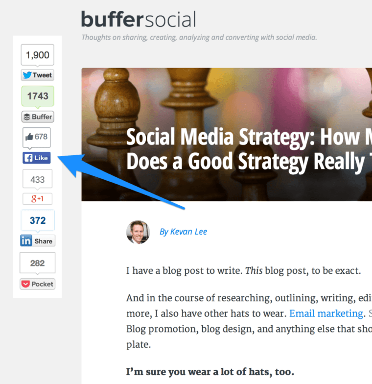
Now for the moment of truth. What happens when someone clicks the Facebook Like button on a Buffer blog post? Drumroll please…

Not a whole lot.
In fact, to the naked eye, nothing happened whatsoever beyond the share number going up by one and the Like button changing to a checkmark.
Let’s hop over to my Facebook page. There are no new updates in my News Feed to tell others that I liked this awesome blogpost. No notifications, no alerts. To find any evidence that I clicked at all, one would have to scroll 50 percent of the way down the page, past my About section, my photos, my friends, my places, my music, my movies, my TV shows, my books, and my groups, all the way to the very last item in the left sidebar: Recent Activity.
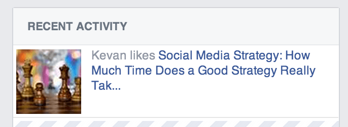
Phew. That’s a long ways down.
It’s worth noting that the Facebook Like experience on your blog might be different than it is on Buffer’s. When I ran the Like experiment by clicking on buttons elsewhere, a share box popped up after I clicked “Like.” You can see this in action at the KISSmetrics blog, for instance. Point being: Test your Like button on your own blog to see what happens.)
What Happens When a Reader Clicks the Facebook Share Button?
OK, new strategy.
How about if we change the Facebook Like button to a Facebook Share button? (Fortunately, there’s an easy setting inside of the Digg Digg plugin to do just that.)
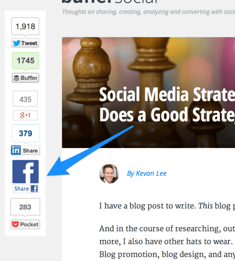
Now that we’ve got the Share button live on the blogpost, what happens when we click it?
Voila! A Facebook Share box arrives.
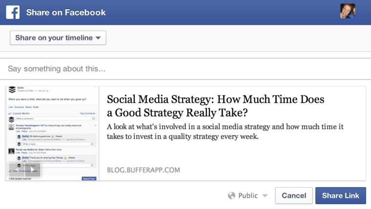
This is likely the box that bloggers expect to show up when someone clicks a Facebook button. Readers get to choose where the message is shared, what they want to say about it, and which picture to use as the thumbnail. After all these options are chosen, the post will show up at the very top of the News Feed on a profile page, and in the News Feeds of all one’s friends (depending on the Facebook algorithm, of course).
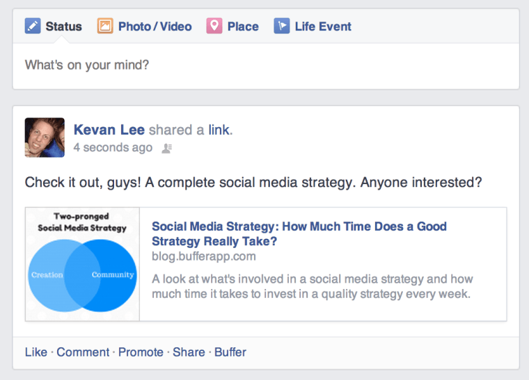
Takeaway: “Liking” and “Sharing” on Facebook are two totally different experiences.
What Happens When a Reader Shares a Story Directly on Facebook?
Let’s continue our Goldilocks trip through Facebook sharing with the most native of share options: Posting a link directly via your Facebook page.
Assuming that there were no Facebook share buttons anywhere on a page and that you really wanted to pass the page along to your Facebook friends, what would you do? You’d grab the URL, head to facebook.com, and share the link yourself.
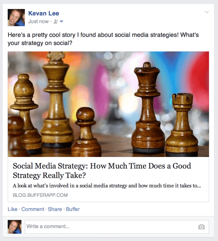
Here’s what that looks like when I share a blogpost directly on Facebook.
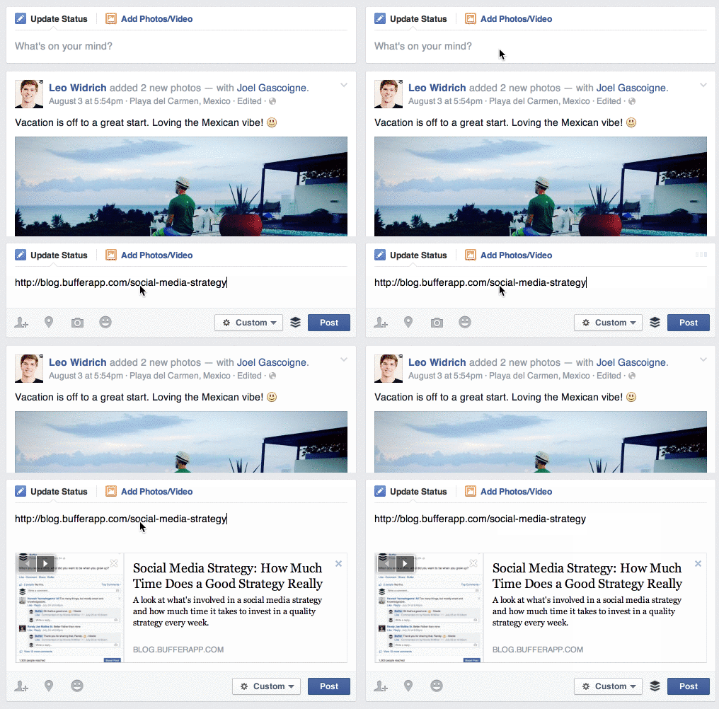
The experience is almost exactly the same as it was for the Facebook Share button. You get to choose who sees your update, what you say about it, and which picture is used as the thumbnail. Here’s the finished product as it appears in my News Feed.
Liking or Sharing: Which Strategy is Preferable?
After reading this far, you may have already chosen your preferred style of Facebook button. Your preference probably has to do with what you hope to gain from your social share buttons, and it’s important to note that there is no right or wrong answer when it comes to liking vs. sharing. Each has its own virtues.
The Like Button is Good for Social Proof
There is power in seeing 600+ Facebook Likes on an article you wrote. The psychological explanation behind this is wisdom of the crowds, where large groups of people approving a certain something (a blogpost, for instance) motivates others to do the same. There may even be a bit of FOMO (fear of missing out), an anxiety from new readers that they need to read this article to catch up with what everyone else has found so great.
The Like Button is Almost Entirely Frictionless
Did you notice how little effort it took for me to complete the process of Liking a blogpost? If you want to make the experience as absolutely easy as possible for your readers, it doesn’t get much easier than the one-click Like button. There’s no messages to create, no networks to navigate. It’s just a simple, easy click.
The Share Button Gets Your Content Maximum Exposure
If you want your story to be seen in more News Feeds, then go with the Share button. Liking a post keeps the post relatively hidden on one’s profile. Sharing a post puts the content front-and-center. (And the rest is up to Facebook’s algorithm to disperse.)
Smashing Magazine ran an interesting experiment on their popular blog, removing all Facebook buttons and trusting readers to share posts on Facebook individually when they found them worth sharing. The results:
Not only will Sharing a post put your content in front of more eyes, your content can look by-and-large how you want it. You can customize the title and description that Facebook grabs as well as the series of pictures that it uses to pull thumbnails.
Here’s how the customization process works in detail.
How to Control What Happens When Someone Shares Your Post to Facebook
OK, here’s the fun part.
You can make your post a Facebook work-of-art with just a few simple tweaks to the code and the images on your page.
Facebook Sharing 101: A Primer on “og” Tags
The engineering behind this customization comes from Facebook’s Open Graph, a system that lets third-party websites (like your blog) speak Facebook’s language when the two communicate. Facebook uses Open Graph functionality on its own network, and outside websites that do the same can create Facebook-optimized updates in a snap.
(Open Graph elements are used by other social networks, too, to customize the sharing that happens there.)
These Open Graph elements are represented in the code with “og” tags (“og” stands for, you guessed it, Open Graph). There are three main tags that deal with the look of a Facebook update.
- og:image
- og:title
- og:description

We’ve found that the easiest way to implement Open Graph code on our blogposts is to use an all-in-one WordPress plugin like WordPress SEO by Yoast that handles the Open Graph elements automatically. In our experience, it works almost perfectly—with the exception of images. I’ll tackle that one below.
How to Check the “og” Tags on Your Blogpost
Before we begin, it might be handy to know if you already have these Open Graph tags in place. To quickly find out, you can inspect the code of your page to see what’s going on behind the scenes.
In your browser, right-click anywhere on the page and select “Inspect Element.”
Then look in the <head> section near the top of your HTML code. Inside the <head> should be some tags that begin with “<meta property=…” Inside these, you’ll find your “og” tags.

You can also check the tags on your content by using Facebook’s Open Graph Object Debugger. This free tool will analyze your page and show you what data Facebook will pull (as well as any errors). Also, if you’re ever in need of resetting the cache for your page, plugging the URL into the Debugger tool tells Facebook to go check your page again for updates.
How to Customize the Title on Your Facebook Article
To create a specific title for your Facebook shares, use the og:title tag.
Best practice here is to keep the title to no more than 90 characters. If your title is longer than 100 characters, Facebook will cut it off at 88.
You can think of this og:title like you would the SEO title for your post. In fact, if an og:title isn’t present, Facebook will grab the SEO title instead. All the best headline-writing advice applies here, as you’ll want to make the most of the bigger, bolder fonts that Facebook uses in article titles.
As an example of what this og:title might look like, here is the code from the blogpost featured in the screengrab above.
<meta property=”og:title” content=”What Does a Community Champion Do at Buffer? An Inside Look”>
If you click over to the post itself, you’ll notice that the actual headline used on the post is “What Is a Community Champion? Inside the World of Buffer’s Community Builder.” We went with a slightly shorter version for the og:title tag for Facebook.
How to Customize the Description on Your Facebook Article
To create a specific description for your Facebook shares, use the og:description tag.
Much like the meta description for your page, this sentence or two should serve as a good introduction to your content. Make it exciting and intriguing—and no need to fill it up with too many keywords because there is no SEO factor here.
Make the first few words count. In the example above, Facebook only revealed 79 characters before cutting off the description. In other cases, you might see up to 200. To play it safe, pack your description with impactful words first.
Here’s an example of what the description tag might look like:
<meta property=”og:description” content=”"What is a community champion?" It’s a question I hear a lot. My response is, "I send out love to our customers all day." But it’s so much more than that!”>
How to Customize the Images on Your Facebook Article
Here’s where things get a little tricky for us.
If you have all your “og” code in place for your piece of content and your content happens to contain a lot of images that are all tagged og:image, what might you expect to happen?
I expected each image to be available as a thumbnail option. I was wrong. There are only three.
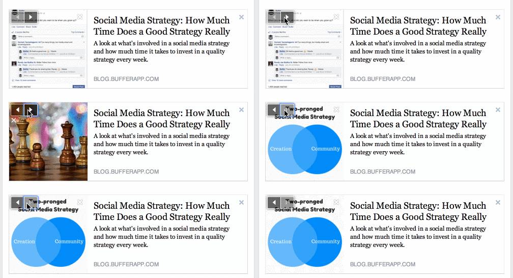
I tested this with the Social Media Strategy post on Buffer, as well as with some blogposts from other sites like KISSmetrics, Quick Sprout, and Hubspot. The results: There are always only three images to choose from, despite the code containing more than three og:image tags.
So which ones does Facebook choose?
In my limited experimentation, I believe Facebook chooses your three largest images.
That’s a good bit of information to know. In my case, most of my largest images are screengrabs, not the custom images I create for each post. It seems that the images I make in Canva and other custom apps are being outshone by some ultra-specific screenshots. Definitely not ideal.
So what are we to do?
Well, there are a couple options.
- You can ensure that the three largest images on your page (typically in terms of height/width) are the three images you most want to be shared by Facebook.
- You can adjust the og:image code to show only the one, two, or three images you want.
The latter option may require a unique plugin that lets you manually change the og:image tags for each piece of content. There are a few plugins out there—like WP Open Graph and the official Facebook plugin—that let you do this fairly easily.
And whatever method you choose to use, you’ll likely want to create some images that are meant to look good on Facebook. I’ll leave the design part up to you, but I can answer the question, “What image size is best?”
Well, in a perfect world, our Facebook shares would look like this:
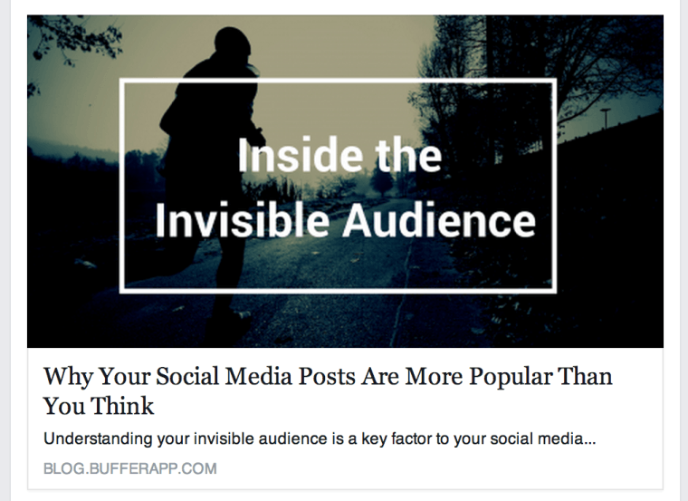
Instead of this:

We want the large, banner photo because it’s those kinds of photos that seem to instinctually draw the most interest and engagement.
To get this banner photo, Facebook recommends that images be at least 1,200 pixels wide by 630 pixels tall. This aspect ratio works out to 1.91:1. You can go as small as 600 pixels wide by 315 pixels tall and still have it appear as a featured image, but in general, you’ll want to get your pics as big as you can so they look good on high-definition monitors.
The takeaway: Create big, beautiful images at an ideal aspect ratio, and make sure they’re bigger than the rest of the images in your post. This is your best bet for getting the Facebook share style you crave.
How Does Your Content Look When it’s Shared to Facebook?
Have you clicked your own Share and Like buttons?
I was really interested to learn the experience of sharing from the Buffer blog. It was not at all what I expected and a bit of a challenge to get it all working perfectly. In the end, changing the way I go about creating my images and being purposeful with how we set up our share buttons were big improvements for the shareability of our blog posts.
Feel free to share this post to see some of the changes in action. ![]()
The Share Button Lets You Customize the Visuals and Message

